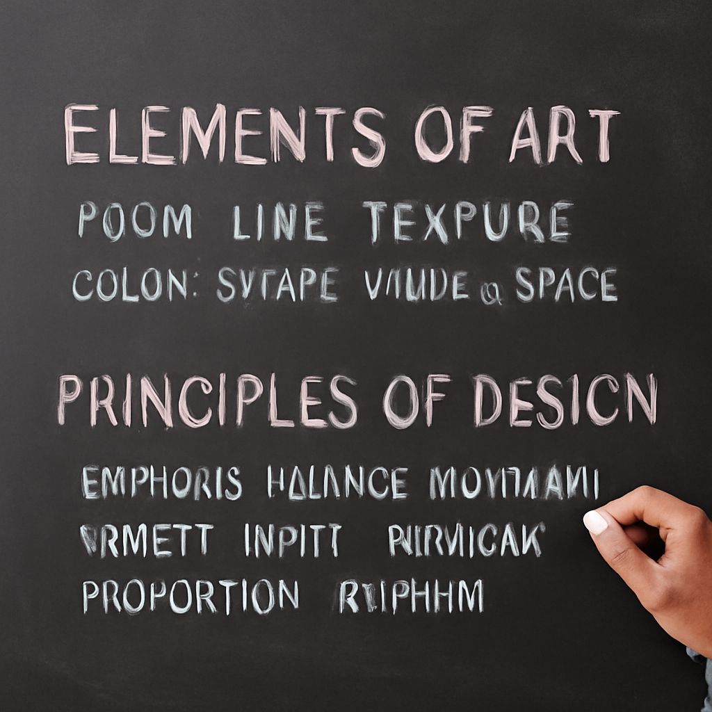
Balance is the distribution of visual weight across a composition. The principles of design balance help you decide where attention settles, whether a layout feels stable, and how much visual tension it can support. Size, color, contrast, position, shape, and texture all contribute to that weight.
Symmetrical balance divides similar elements evenly around a central axis, creating order and predictability. Asymmetrical balance uses different elements that still counteract one another: a large, pale shape might balance several smaller, dark shapes, for example. The rule of odds and intentional texture can make that asymmetrical arrangement feel both stable and lively.
Principles of Design Balance: How Visual Weight Works
Visual weight is the amount of attention an element attracts. A large object usually carries more weight than a small one, but scale is only one factor. Dark colors, saturated hues, sharp edges, strong contrast, isolated placement, and dense detail can make an area feel heavier than its physical size suggests.
Symmetrical balance is effective when you want clarity, formality, or a calm focal point. A centered headline above two equal columns is easy to scan because each side supports the other. The arrangement can, however, feel static if every detail mirrors its opposite.
Asymmetrical balance distributes unequal elements through visual compensation. A large, low-contrast photograph on one side of a page may balance a compact, high-contrast text block on the other. The result feels less rigid, but it requires closer judgment. Compare the apparent pull of each area rather than matching dimensions mechanically.
How the Rule of Odds Shapes Grouping
The rule of odds suggests that groups of three, five, or another odd number often feel more natural and engaging than evenly divided groups. With an odd number of objects, the eye can identify a center or create a clear visual hierarchy. Three vases on a shelf, five leaves in a still life, or three content cards can feel more active than a pair of matching items.
Use odd-number groupings when you want a focal point, a relaxed rhythm, or an asymmetrical arrangement. In a group of three, one element can lead while the other two provide support. Varying height, position, or scale strengthens that hierarchy without making the group appear random.
The rule of odds is a useful tendency, not a law. Even groupings work well for symmetry, repetition, paired relationships, and orderly interfaces. A grid of four product images may communicate comparison more clearly than three. Choose the number that supports the purpose, then adjust spacing and emphasis so the grouping reads as intentional.
How Texture Changes Apparent Visual Weight
Texture as an element of art affects balance by changing how much visual information an area contains. Rough, dense, or highly patterned surfaces attract attention and can appear heavier than smooth, open surfaces of the same size. Texture may be physical, such as woven fabric, or visual, such as a repeated grain, brushstroke, or speckled pattern.
To stabilize a composition, place a textured area opposite a larger but quieter area. For example, a small panel of dark brick can balance a broad wall of pale plaster because the brick has greater contrast and surface activity. The reverse may also work: a large, richly textured shape can be countered by a small, strongly colored accent.
Texture can also disrupt balance deliberately. A smooth, minimal layout with one rough or sharply detailed region directs attention immediately to that area. Use this effect for a callout, focal object, or visual transition. If every area has equally strong texture, the composition may lose hierarchy and feel crowded.
Building Balanced but Lively Compositions
Build a balanced composition by evaluating structure first, then adding variation:
- Place the primary mass. Establish the largest shape or most important content area before adding secondary details.
- Find its counterweight. Use position, contrast, color, or a small odd-number group to offset the primary mass instead of copying its size.
- Control the grouping. Test three or five related elements when a pair feels too static, but keep one element visually dominant.
- Assign texture selectively. Reserve dense patterns or tactile surfaces for areas you want to emphasize; leave quieter regions to provide relief.
- Check the composition from a distance. Squinting or reducing the design helps reveal whether texture, darkness, and contrast have made one area unexpectedly heavy.
The finished arrangement should have a clear visual anchor, a supporting counterweight, and enough quiet space for both to register. Balance does not require equal parts; it requires a deliberate relationship between visual weight, grouping, and surface detail.