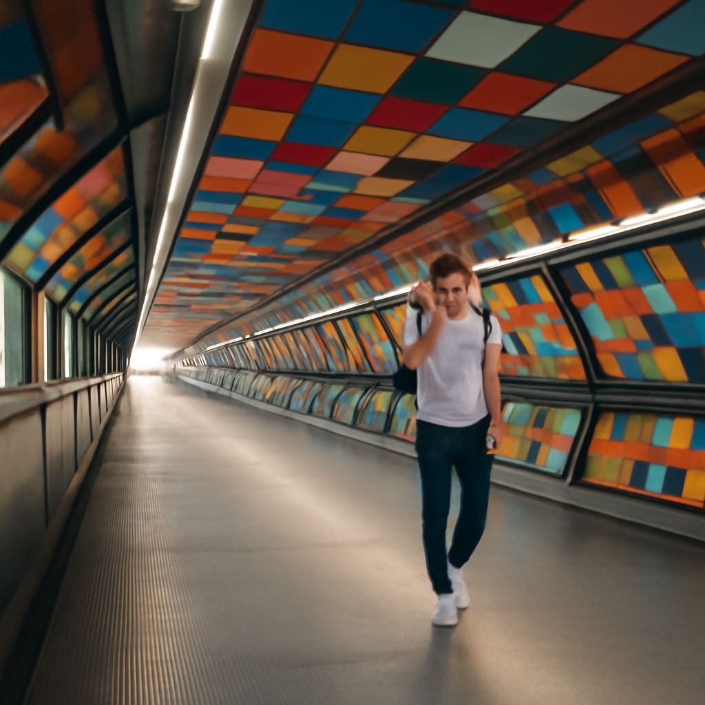
Value and line are visual tools that organize attention. Value as an element of art describes how light or dark something appears, while line creates a path, edge, or directional flow. In photography, the strongest composition often combines both: a line points toward the subject, and tonal contrast keeps that line visible long enough for the eye to follow it.
Value can reveal depth, separate overlapping forms, and establish emphasis. Line can be literal or suggested. Together, they turn an arrangement of shapes and tones into a guided visual experience.
Value as an Element of Art: Light, Midtones, Dark, and Contrast
Value is the relative lightness or darkness of a color, shape, or area. A white wall, gray pavement, and black coat demonstrate three broad value zones: light, middle, and dark. The same color can have different values depending on illumination; a red object in direct sun may be lighter than the red side in shadow.
Photographers often assess value by mentally reducing a scene to grayscale. This exposes the tonal structure beneath color. A bright subject against a dark background has strong value contrast and attracts attention quickly. A gray subject against a similar gray background has low contrast, so its edges and details are less distinct.
Value also describes the distribution of tones across the frame. A high-key image is dominated by light values, while a low-key image relies more heavily on dark values. Neither approach is automatically better. The useful choice depends on whether the photograph needs openness, clarity, mystery, weight, or separation between forms.
Line as an Element of Art: Actual and Implied Paths
Line as an element of art is a mark or boundary that has length and direction. It may be an actual line, such as a road, railing, telephone wire, architectural edge, or branch. These lines are physically present and usually easy to identify.
An implied line is not drawn as a continuous mark. Instead, the viewer completes it from visual cues. A person looking toward a subject creates a line of sight. A row of fence posts produces a directional sequence. A pointing hand, aligned shadows, repeated windows, or several figures facing the same way can all establish an implied path.
Lines also carry different visual behaviors. Horizontal lines tend to feel stable, vertical lines can suggest height, and diagonals introduce energy or movement. Curving lines can slow the eye and create a more gradual route. These associations are flexible, but they help a photographer predict how a viewer may scan the frame.
Leading Lines in Photography: How Direction Guides Attention
Leading lines in photography guide the eye from one area of the image to another, often toward a subject or focal point. A path beginning near the lower edge and narrowing toward a distant person creates depth while directing attention. Converging railway tracks, a river bend, or the edge of a building can perform the same function.
A leading line does not need to end exactly on the subject. It can point near the subject, frame it, or lead into open space that balances the composition. Its effectiveness depends on direction, placement, and visual continuity. A line that enters at the edge and stops abruptly may create tension; one that continues through several connected forms may produce a smooth reading path.
Implied lines can be subtler but equally powerful. In a portrait, the subject’s gaze may lead toward a bright object in the background. In a street photograph, pedestrians, signs, and shadows may align to move attention toward an intersection. The viewer follows the relationship among these elements rather than a single drawn mark.
Combining Direction With Tonal Contrast to Control Emphasis
A line guides attention only when the eye can distinguish it from its surroundings. This is where value strengthens or weakens direction. A dark road edge against pale snow remains legible across the frame, so its diagonal pull is strong. The same edge in deep shadow beside dark pavement may disappear, breaking the route before it reaches the subject.
Use local contrast, not just overall contrast. A bright subject can preserve emphasis even in a low-key photograph if the surrounding values are darker. Conversely, a highly contrasting foreground line may attract attention away from the intended subject. Check whether the line is the most noticeable tonal event in the frame and adjust its position, brightness, or surrounding values when necessary.
- To strengthen a line: place it against a contrasting value, preserve its visibility through the frame, and let its direction support the subject.
- To soften a line: reduce its tonal difference from the background, interrupt it with shadow, or use a gentler curve.
- To create depth: begin with a larger, clearer line in the foreground and allow it to narrow, fade, or converge toward the distance.
During editing, inspect a grayscale version of the photograph. If the line vanishes before reaching the focal area, restore separation with exposure, local contrast, or a crop that removes competing dark and light shapes. The goal is not maximum contrast everywhere; it is enough tonal structure for the intended path to remain clear.