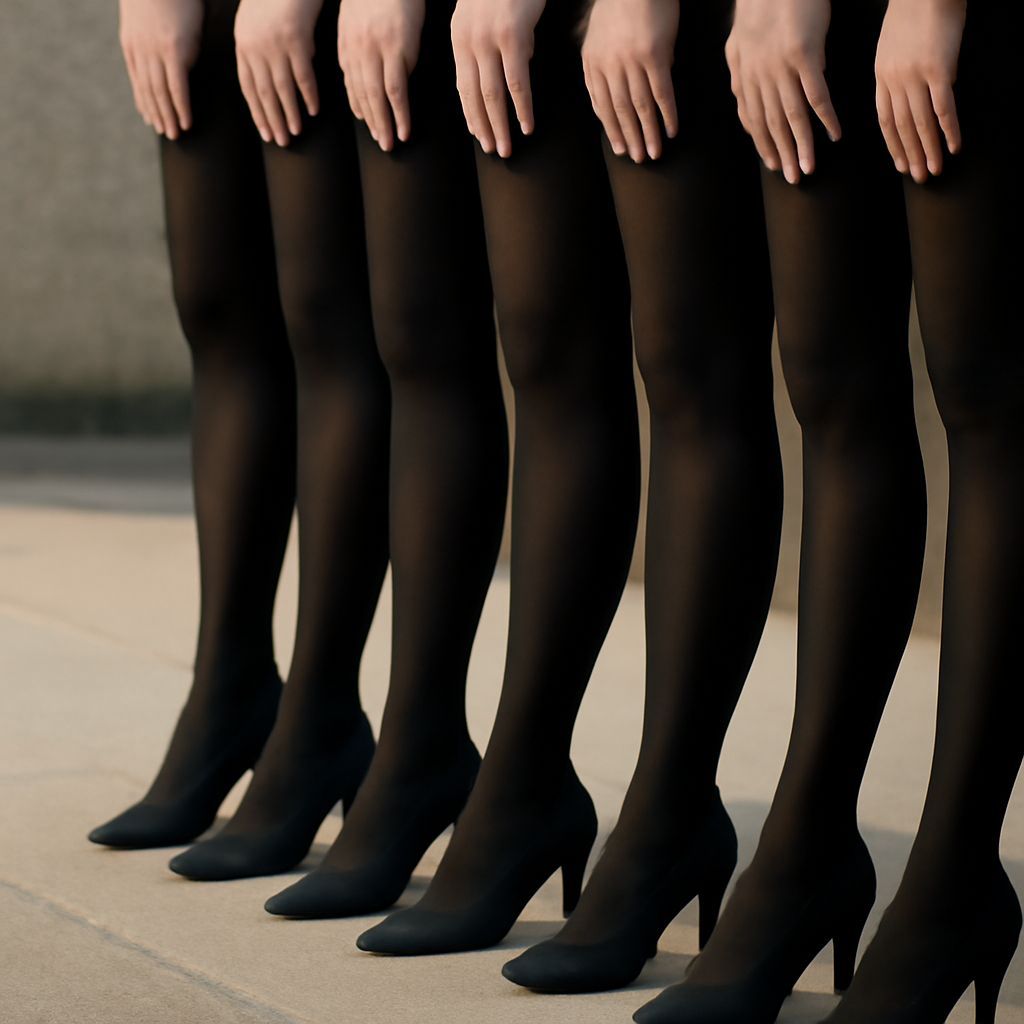
Contrast is the difference that makes an image read clearly. In art, it can come from value, color, scale, texture, or shape, and it is strongest when it points the eye to a focal point instead of scattering attention. The same idea works with positive and negative space: forms gain clarity because the surrounding space helps define them.
Variety as a principle of design adds movement and interest, but only when it is controlled. The goal is not to fill every area with something new; it is to create visual change that still feels intentional, readable, and balanced.
Types of Contrast in Art
Common contrast in art examples show how one difference can change the whole mood of a composition. Value contrast is the most direct: Caravaggio used deep shadows against bright highlights to model form and create drama. A black shape on a white ground works the same way in a poster or drawing.
Color contrast can be just as forceful. Warm red against cool blue feels energetic; yellow beside violet feels sharper still. Henri Matisse often used bold, simplified color relationships to keep the image vivid without relying on heavy detail.
Other useful contrasts include scale, texture, and shape. A tiny figure in a large field feels isolated. Smooth paint next to rough collage adds tactile tension. A circle beside a jagged angle creates an immediate visual break. When several types of contrast work together, the image gains emphasis without becoming cluttered.
How Positive and Negative Space Define Each Other
Positive space is the subject: the object, figure, or mark. Negative space is the area around and between those forms. They are reversible, which means the eye can shift between seeing the object and seeing the space as the active shape. In a vase-and-profile illusion, for example, the same edges can read as a vase or as two faces depending on where attention lands.
This reversible relationship is why spacing matters so much. A strong silhouette becomes clearer when the surrounding area is simple and purposeful. At the same time, a wide negative field can make a small positive form feel more deliberate and more important. The space is not empty; it is part of the structure.
Artists use this effect to guide rhythm. Tight intervals between forms create compression, while open gaps slow the eye down. Both can work in one composition if the transitions are deliberate.
Variety as a Principle of Design
Variety keeps design from becoming flat. It introduces change in line, shape, size, texture, or placement so the viewer has something to explore. In a painting, repeated circles might be joined by one square. In a layout, a cluster of dense marks might be balanced by a calmer open area.
The key difference between controlled variety and unrelated decoration is purpose. Controlled variety repeats a visual rule while changing one variable at a time. Unrelated decoration adds elements that do not help the composition.
- Controlled variety may change size while keeping the same palette.
- Controlled variety may shift texture while preserving alignment.
- Unrelated decoration changes everything at once, with no clear visual logic.
When variety supports the main structure, it creates rhythm. When it competes with the structure, it becomes noise.
Combining Difference With Visual Coherence
The strongest compositions usually limit the number of competing ideas. One high-contrast area can carry the focal point, while secondary areas use softer differences to support it. A painting with a bright accent on a muted ground, or a poster with one dominant shape and repeated smaller echoes, feels unified because the differences are coordinated.
To keep contrast, space, and variety working together, repeat one or two design decisions throughout the piece: a consistent edge quality, a restricted palette, a recurring shape, or a steady spacing pattern. Let the negative space breathe where the contrast is strongest, then use smaller variations elsewhere to keep the eye moving. That balance gives the work energy without losing coherence.