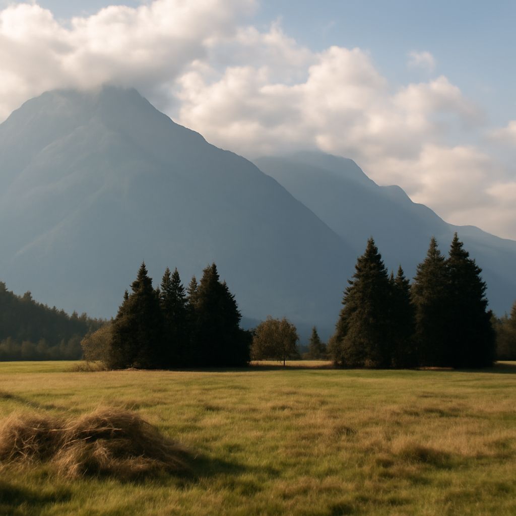
In the world of art, colors are more than just visual stimuli; they evoke emotions, create atmosphere, and communicate ideas. Among the broad spectrum of hues, cool colors hold a special place for their unique ability to induce feelings of calmness and tranquility. This guide explores what are the cool colors, how they compare to warm hues, and their application in art to set mood and tone.
What Are Cool Colors?
Cool colors predominantly include hues such as blue, green, and purple. These colors are typically associated with elements of nature like the sea and sky. Unlike their warm counterparts, cool colors tend to recede in a composition, creating a sense of depth and distance. They are often used to convey calmness, serenity, and soothing effects, making them ideal for artworks that aim to relax or reflect contemplation.
Cool Colors vs. Warm Colors in Art
The distinction between warm and cool colors in art is essential for artists who wish to manipulate the mood and perception of their work. Warm colors, such as red, orange, and yellow, are vivid and energetic, often used to draw attention or evoke emotions like warmth and excitement. In contrast, cool colors are more subdued and are used to create a relaxed and calming ambiance. For example, a landscape painting highlighting a sunset might use warm colors to depict the setting sun, while cool colors would represent the vast sky or the shadows cast on the ground, providing a balanced composition.
Using Cool Colors to Create Mood
Artists utilize cool colors and warm colors strategically to evoke specific emotions or atmospheres. Cool colors can be employed to produce a serene and peaceful setting, often seen in works depicting winter scenes or tranquil bodies of water. These colors are also effective in creating a sense of detachment or melancholy, as seen in Edvard Munch’s “The Scream,” where a vibrant red sky contrasts sharply with the cool blues and greens of the landscape, enhancing the painting’s emotional intensity.
In interior design, cool colors are often chosen for their ability to make a space feel larger and more open. Similarly, in fashion, shades like teal or lavender can convey sophistication and elegance. By understanding the emotional impact of cool colors, artists and designers can craft environments that resonate with their audience’s desired feelings.
Examples of Cool Colors in Art
Numerous artworks exemplify the effective use of cool colors to communicate mood and narrative. Vincent van Gogh’s “Starry Night” employs deep blues and swirling greens to create a sense of mystery and movement, contrasting with the bright yellows of the stars and moon. Claude Monet’s “Water Lilies” series utilizes a range of cool colors to evoke the tranquility of the ponds he painted, inviting viewers into a moment of reflection.
In contemporary art, cool colors remain a powerful tool for artists to explore themes of isolation, introspection, and calmness. Digital and multimedia artists use these hues to craft immersive experiences that engage the viewer on both an emotional and aesthetic level.
The choices between cool and warm colors in art are pivotal in defining an artwork’s character and emotional impact. Whether you’re an artist aiming to create a serene landscape or a designer looking to evoke solitude and peace, understanding the role of cool colors can enhance your creative endeavors.