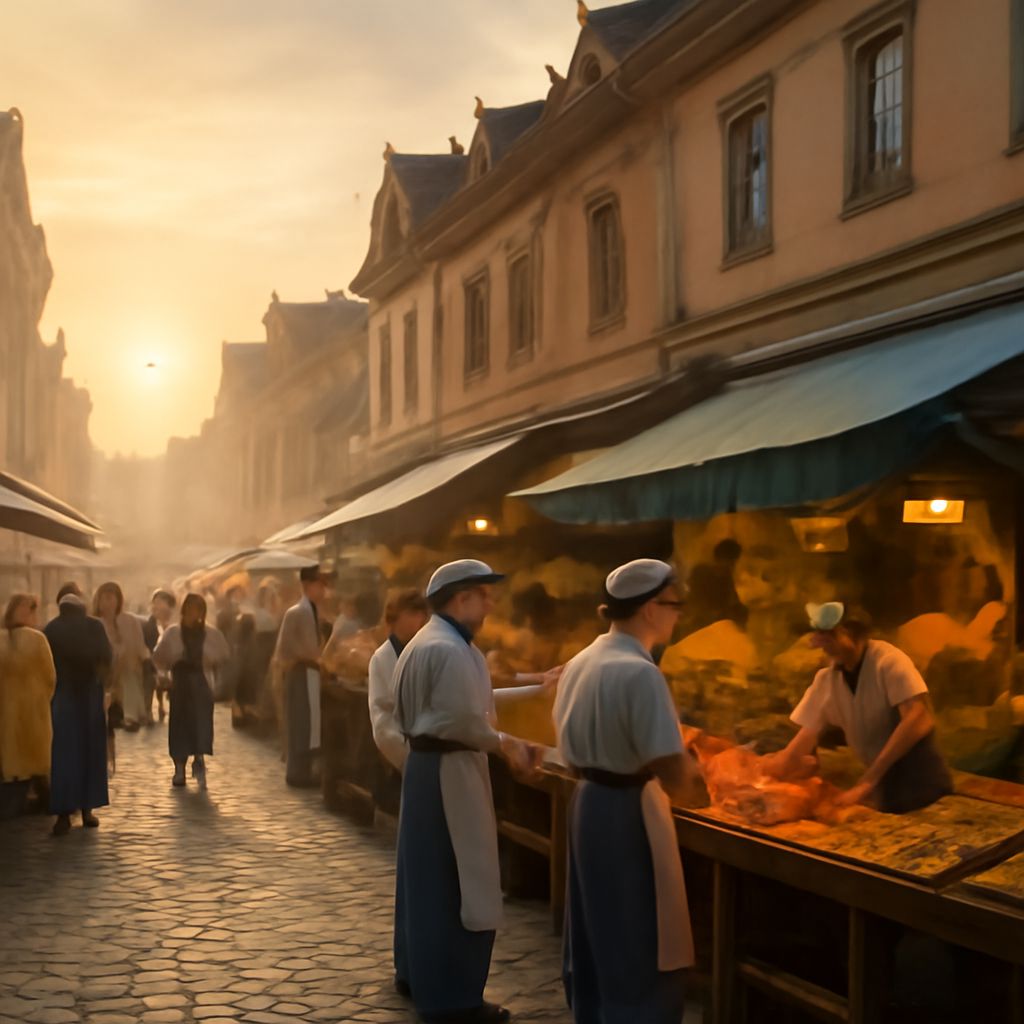
The elements of art are the basic visual ingredients of an image: line, form, value, color, texture, and space in art. On their own, they are simple. In composition, they become a system that shapes attention, mood, and structure.
The goal is not to collect elements one by one, but to understand how they work together. A strong image uses contrast, repetition, rhythm, and placement to create unity in art without making everything look identical.
The Elements of Art: Line, Form, Value, Color, Texture, and Space
Line is the path a viewer’s eye follows. It can be straight, curved, thick, broken, or implied. A diagonal road, a pencil contour, or the edge of a building all create line. Lines can suggest motion, stability, or tension depending on direction and weight.
Form is the sense of three-dimensional volume. In drawing and painting, a round fruit becomes form when light and shadow make it feel solid. In photography, a face turned toward one side creates visible planes that read as form.
Value refers to light and dark. A bright window against a dark room creates strong value contrast, and that contrast can quickly separate focal areas from the background. Without value differences, even a carefully composed image can feel flat.
Color carries temperature, emotion, and emphasis. A vivid red coat in a muted street scene becomes a clear accent. Color can unify a composition when repeated in small doses, or it can energize it by introducing contrast.
Texture in art is the visual or tactile quality of a surface. Rough stone, brushed fabric, smooth glass, and grainy paper each suggest different textures. In a painting, texture may be visible through brushwork; in a photo, it may be read through light hitting bark, skin, or metal.
Space in art is the area around, between, and within forms. It includes positive space, which is occupied by subjects, and negative space, which surrounds them. A subject placed against open sky feels different from the same subject crowded into a tight frame.
How Unity in Art Connects Separate Elements
Unity in art is the relationship among elements, not sameness. A unified image does not require every shape, color, or texture to match. It requires the parts to feel like they belong to the same visual system.
Unity often comes from repetition. A repeated curve in a figure, a recurring color in the background, or a consistent edge quality can tie separate areas together. Repetition gives the viewer a pattern to recognize, even when the subject changes.
Unity also comes from controlled contrast. Too little contrast makes an image dull; too much can make it feel scattered. A unified composition usually balances difference and connection, so the eye can move without losing the overall structure.
Scale and alignment matter as well. If small details echo larger shapes, the composition feels intentional. If objects share a common direction, horizon, or rhythm, the image reads as one organized field rather than unrelated parts.
In practical terms, unity is built by asking which element should lead and which should support. A portrait may use strong value contrast on the face, softer texture in the clothing, and restrained background color so the whole image stays coherent. The parts remain distinct, but they work as a single visual argument.
Leading Lines, Texture, and Space as Composition Tools
Leading lines photography uses roads, railings, fences, shadows, riverbanks, or architectural edges to guide the viewer toward the subject. These lines do more than decorate the frame; they create direction. A line that starts at the corner of the image and points inward can pull the eye into the composition immediately.
Leading lines are strongest when they support a clear destination. A path that curves toward a person, a bridge that aims at a skyline, or stair rails that converge on a doorway all help the viewer understand where to look first. When the lines are too many or too equal, they compete instead of lead.
Texture in art adds depth and emphasis by changing how light or mark-making behaves across a surface. A textured foreground can ground an image, while a smoother background can keep attention where you want it. In close-up work, texture becomes a primary subject; in wider compositions, it often acts as a supporting layer that enriches unity.
Space in art organizes breathing room. Negative space around a subject can isolate it, increase clarity, and create elegance. Crowded space can build energy or tension. The decision is compositional: generous space lets a form stand out, while compressed space can make the image feel active and immediate.
These three tools work best together. A strong line can move the eye across a textured surface and stop at an area of open space, where the subject feels more important. In other words, line directs, texture anchors, and space frames the visual hierarchy.
If a composition feels busy, reduce competing directions. Strengthen one main leading line, simplify surrounding textures, and widen the negative space around the focal point. If it feels too empty, add texture or secondary lines to create a clearer path for the eye.
Using a Split-Complementary Color Scheme
Split complementary colors are built from one base color plus the two colors beside its direct complement on the color wheel. For example, blue can be paired with yellow-orange and red-orange. The result is contrast with more flexibility than a strict complementary pair.
This scheme is useful because it gives you tension without harshness. One color can dominate, while the two split complements provide accents and support. That balance helps the palette feel lively but still controlled, which is especially valuable when color must reinforce unity instead of disrupt it.
Start with a dominant color that sets the mood. Then use one split-complementary color for emphasis and the third for smaller supporting notes. If the three colors are equally strong, the palette may become noisy. If one leads and the others stay secondary, the composition feels organized.
Value and saturation are as important as hue. A split-complementary palette works better when one color is muted, another is medium in intensity, and the accent is the brightest. This keeps attention where you want it and prevents the scheme from flattening into pure decoration.
For example, a cool blue scene can be energized with orange-red details and golden accents. A green-based image can be balanced with red-violet and red-orange touches. In both cases, the palette gives structure, supports focal points, and helps separate foreground from background without losing harmony.
Used together, the elements of art, unity, leading lines, texture, and split complementary colors create a composition that feels deliberate. The viewer sees where to look first, what connects the parts, and how the image holds together as a whole.