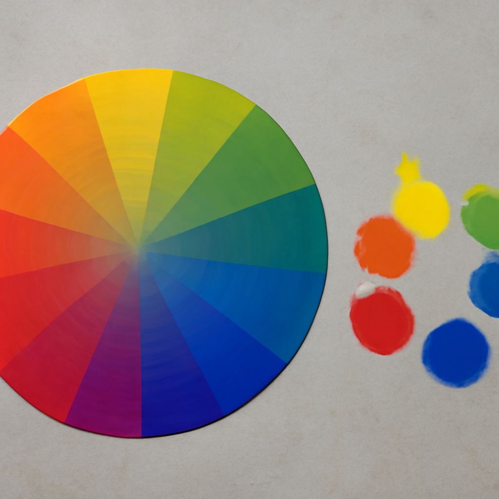
An artistic composition built around blue gains a clear organizing color, but balance depends on more than choosing a pleasing shade. In color theory in art, blue is commonly paired with its complementary opposite, orange. This contrast can make a focal subject advance visually while blue recedes and stabilizes surrounding space.
Use the strict blue-orange relationship when you want maximum contrast. For quieter results, adjust the orange toward rust, terracotta, or ochre, reduce its saturation, or let a neutral color occupy more of the composition.
Artistic Composition: Start With Blue’s Orange Complement
Blue and orange sit opposite each other on the traditional artist’s color wheel, so they create complementary contrast. A saturated orange mark against a deep blue field attracts attention quickly because the hues differ strongly in temperature and visual energy.
Begin by deciding which color carries the subject. If blue fills the background, an orange object, garment, or highlight becomes a natural focal point. If orange dominates the subject, use blue in the environment to frame it. A useful starting proportion is roughly 60 percent dominant blue, 30 percent supporting neutrals or related hues, and 10 percent orange accent.
Keep the complement focused. Repeating bright orange across every area weakens hierarchy, while reserving it for the subject, leading edge, or small accents gives the eye a deliberate path.
Color Theory in Art: Choices Inside a Composition
Color decisions should support the composition’s structure. Hue separates areas by color family, value separates them by lightness, and saturation controls visual intensity. Together, these properties determine whether a blue-centered image feels calm, dramatic, spacious, or crowded.
First identify the largest color mass: perhaps a navy background, a pale blue sky, or a cobalt figure. Then choose supporting colors that clarify the subject rather than competing with it. Blue-green and blue-violet create related transitions; cream, gray, and brown provide restraint; orange supplies the strongest opposing note.
Warm accents are not automatically complementary colors. A golden yellow may harmonize with blue, but it is not the strict blue complement. Treat it as a neighboring warm choice or a broader palette decision, and judge it by the hierarchy it creates.
What Blue Complementary Colors Really Mean
The phrase blue complementary colors usually refers to orange and its variations. However, “blue” covers a wide range of hues. A green-leaning cyan can work with a red-orange, while a violet-leaning ultramarine often responds more naturally to yellow-orange. The exact visual opponent shifts as the blue moves around the wheel.
For practical painting, preserve the core relationship while tuning the temperature:
- Cobalt blue and clear orange: crisp, energetic, and highly legible.
- Ultramarine and burnt orange: rich, dramatic, and less aggressive.
- Teal blue and coral: lively, modern, and warmer in mood.
- Powder blue and terracotta: soft, earthy, and approachable.
These variations remain related to the blue-orange opposition, but muted or shifted complements produce less vibration than two fully saturated hues.
Value and Saturation Matter as Much as Hue
Hue alone cannot establish emphasis. A small area of bright orange may dominate a large field of dull blue because saturation attracts attention. Likewise, a pale orange against near-black navy can become the brightest point and therefore the visual anchor.
Before refining color, check the composition in grayscale. If the focal area disappears, strengthen its value contrast: place light blue beside dark orange, or dark blue beside pale peach. For a quieter image, keep the values closer and use saturation selectively.
Proportion also changes intensity. Equal areas of saturated blue and orange can feel loud and divided. A dominant blue field with restrained orange accents usually feels more stable. If the image needs urgency, enlarge the orange area or increase its saturation rather than adding many unrelated colors.
Build Balanced Blue-Centered Palettes for Different Moods
Choose a palette by mood, then control its proportions and focal contrast:
- Calm and airy: powder blue as the dominant color, off-white as the support, and a small amount of muted terracotta. Keep values light and saturation low.
- Bold and energetic: cobalt blue, vivid orange, charcoal, and a little white. Use orange on the focal subject and reserve white for the sharpest highlights.
- Earthy and intimate: ultramarine, burnt sienna, ochre, and warm gray. Let sienna function as a near-complementary accent rather than a bright opposing block.
- Cool and atmospheric: teal blue, slate, pale blue-gray, and coral. Use coral sparingly so the scene remains spacious while retaining a warm focal point.
Lay in the dominant blue first, establish the major light and dark pattern, and add the warm accent last. If the accent overwhelms the subject, lower its saturation, reduce its area, or shift it toward a neutralized orange.