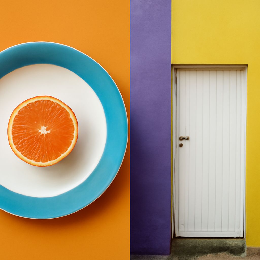
Balance in art is the distribution of visual weight so a composition feels stable, intentional, and neither accidentally tilted nor overly static. Color contributes to that stability through hue, value, saturation, area, and placement. Complementary colors can create strong equilibrium without occupying equal amounts of space.
For traditional artist’s color wheels, blue pairs with orange and yellow pairs with violet. The most effective palette depends on the exact hue and on how strongly each color is used. A small, intense complement can often counterbalance a much larger, quieter color field.
What Balance in Art Means: Symmetrical and Asymmetrical Stability
Symmetrical balance distributes similar visual elements on opposite sides of a central axis. A painting with equal blue and orange shapes mirrored across the center is stable and formal. This approach is easy to read, but it can also feel predictable.
Asymmetrical balance uses different elements that carry comparable visual weight. A large pale-blue area on one side may be balanced by a smaller, dark-orange form on the other. The shapes are unequal, but their combined effects feel even. This is often more useful for energetic compositions because it allows movement, hierarchy, and a clear focal point.
Color weight is affected by more than physical size. Dark values, high saturation, sharp edges, warm hues, and isolated marks usually attract attention and feel heavier. A quiet, low-contrast area can occupy most of the surface while remaining visually light.
Complementary Colors for Blue: Orange and Hue Variations
On a traditional color wheel, orange is the basic complement of blue. The pairing creates strong contrast because the hues sit opposite one another. A broad field of muted blue-gray can therefore support a small, saturated orange accent without requiring an equal quantity of orange.
Adjust the complement to match the blue’s bias. Green-blue hues, such as turquoise or cyan, work with red-orange. Violet-blue hues, including ultramarine, often need yellow-orange to feel balanced. A deep navy with a small burnt-orange shape produces a restrained, grounded effect; cobalt with bright tangerine feels sharper and more energetic.
For example, place a small vivid orange chair near the lower-right edge of a large, desaturated blue room. The chair’s warmth, saturation, and isolated position give it enough visual weight to balance the room without competing with every blue surface.
Complementary Colors for Yellow: Violet and Hue Variations
Violet is the basic complement of yellow in traditional pigment-based color theory. Yellow is naturally light and visually advancing, while violet can provide depth and weight. A pale yellow background with a compact violet shape may feel balanced even when the violet covers far less area.
Use a red-violet with warm golden yellow, and a blue-violet with lemon or greenish yellow. Bright yellow paired with saturated violet creates maximum drama. For a quieter result, combine creamy yellow with dusty lavender or ochre with subdued aubergine.
Consider a large field of soft butter yellow containing one narrow, dark-violet doorway. The doorway is small, but its low value and strong hue contrast make it a convincing counterweight. Repeating a tiny violet detail elsewhere can connect the accent to the wider composition.
Balance Color by Area, Value, Saturation, and Placement: Small Accents, Large Quiet Fields
- Area: Use a larger amount of a muted or light color and a smaller amount of its stronger complement. A composition might be mostly blue-gray, with a few percent of intense orange reserved for the focal point.
- Value: Dark colors generally carry more weight than pale ones. A small navy or violet mark can balance a broader field of light yellow, while a pale orange may need more area to register.
- Saturation: A pure, vivid accent attracts attention faster than a grayish version of the same hue. Keep most of the palette softened, then concentrate saturation in one orange or violet feature.
- Placement: Position accents where they counter a dominant mass. A small warm mark near the edge can stabilize a large cool shape on the opposite side; moving it toward the center may reduce the sense of counterweight.
Begin with the dominant field, then add its complement in the smallest amount that establishes focus. If the accent overwhelms the composition, lower its saturation, lighten its value, or reduce its isolation before adding more color. If the composition feels dull, strengthen the complement or move it into a more strategic position.