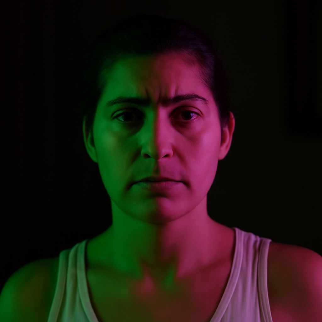
Complementary color work in photography starts with hue, not with a fixed swatch. Pink is a tint, so its complement depends on what it is tinted from: a pink that leans red behaves differently from one that leans magenta. Blue works the same way in reverse. The basic complement to blue is orange, but the best match shifts as blue moves toward violet or green.
Use that shift to build clearer image hierarchy. The strongest result usually comes from one dominant color, one supporting color, and a small accent that sharpens attention without competing with the subject.
How Complementary Color Relationships Work
Complementary colors sit opposite each other on the color wheel, so they create contrast in temperature, energy, and visual weight. In a photograph, that contrast helps separate subject from background and prevents the frame from feeling flat.
For pink and blue, the exact complement is rarely a single answer because both colors can drift. Pink may lean warm, cool, red, or violet. Blue may lean cyan, violet, or green. The closer you identify the bias, the better your match will feel.
Complementary Colors for Pink
Warm Pinks: Coral, Rose, and Salmon
Warm pinks often pair best with green-blue complements such as teal, aqua, sea green, and cool sage. Coral and salmon especially like muted turquoise or blue-green, because those hues balance the warm red-orange notes inside the pink.
If the pink is soft and dusty, keep the green slightly muted too. A pale rose dress against olive foliage, for example, feels calm and elegant. A brighter coral subject against teal props feels sharper and more playful.
Cool Pinks: Magenta, Fuchsia, and Mauve
Cooler pinks shift their complement toward yellow-green, lime, chartreuse, and fresh leaf green. Magenta and fuchsia have a strong blue-red bias, so they look more vivid beside citrus greens than beside blue-green tones.
For mauve, a softer yellow-green or muted olive usually reads better than an electric lime. That keeps the contrast controlled while still making the pink stand forward in the frame.
What Complements Different Blues
Blue-Leaning Toward Violet
When blue drifts toward violet, the complement moves warmer than pure orange. Think amber, golden orange, apricot, rust, and muted peach. These colors echo the red side hidden inside the blue-violet and create a richer, more refined contrast than a saturated traffic-cone orange.
In a portrait, a blue-violet jacket against warm amber light can feel polished and cinematic. If the orange side is too strong, reduce its saturation so it supports the subject instead of overpowering it.
Blue-Leaning Toward Green
Blue-green and cyan blues still connect to orange, but the most useful complements often land in red-orange, terracotta, coral, and warm rust. The greener the blue becomes, the warmer and earthier the opposite can feel.
A cyan pool against terracotta tile works because the warm-orange family pulls the cool tone into focus. A deep teal object against peach or apricot has the same effect with less intensity.
Using Complementary Palettes in a Photograph
Dominant, Supporting, and Accent Proportions
Plan the frame by proportion first. A reliable starting point is 70 percent dominant color, 25 percent supporting color, and 5 percent accent. A pink subject can occupy the dominant share, with green surroundings as support and a small orange detail as the accent. The reverse works just as well: a blue background can dominate, with pink styling and a warm accessory as the smallest accent.
For a product shot, use a blue backdrop at 70 percent, a pink package at 25 percent, and a tiny coral label at 5 percent. The accent should be small enough to guide the eye, not split it.
Placement, Value, and Saturation
Place the brightest or most saturated complement where you want attention first, usually near the subject’s face, edge, or focal object. Keep large fields of color lower in saturation so they support the composition instead of flattening it.
Value matters as much as hue. A pale pink against a dark green background reads differently from a bright pink against the same green. If both colors are equally saturated and equally bright, the image can feel noisy. If one is darker, one lighter, and one slightly muted, the contrast becomes cleaner and the subject reads faster.
In photo composition, small warm accents on cool blue or small cool accents on warm pink usually give the strongest balance. Use the complement to frame the subject, then let proportion and placement do the rest.