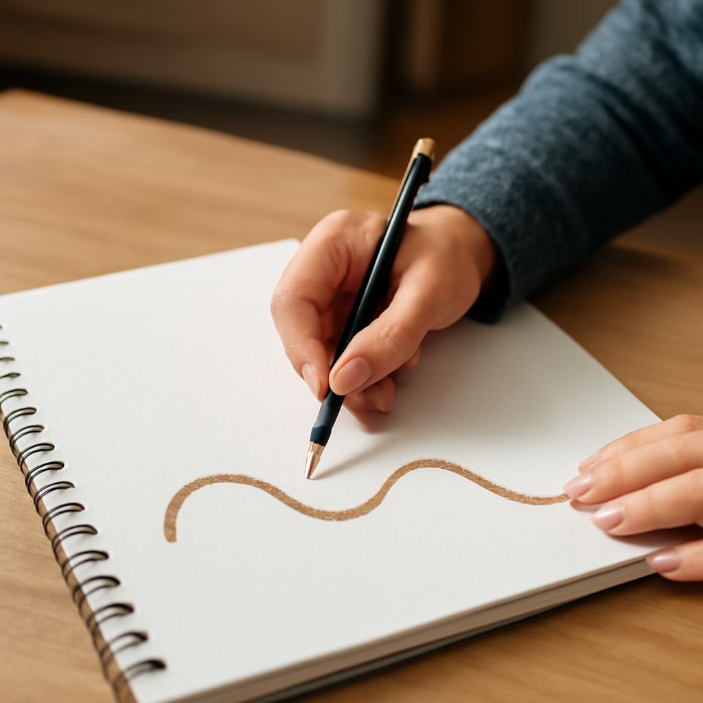
Line definition in art begins with a simple idea: a line is a mark that can describe, divide, or direct. Positive space in art is the occupied shape or form that carries visual weight, while movement as a principle of design describes how the viewer’s eye travels through a composition. When those three elements work together, a page, canvas, or layout feels deliberate instead of static.
The strongest images use line, shape, and spacing as a viewing system. Directional marks lead attention, occupied forms anchor it, and the spaces between them set the pace. That is how a composition can feel calm, energetic, orderly, or restless without changing the subject itself.
Line Definition in Art: Mark, Edge, and Direction
A line in art is more than a drawn stroke. It can be a visible mark, the edge of a form, or an implied path created by repeated shapes, gaze, or movement inside the composition. In practice, line does three jobs at once: it names a boundary, it suggests direction, and it shapes rhythm.
Vertical lines tend to feel stable and upright. Horizontal lines often read as quiet or grounded. Diagonal lines introduce momentum, while curves soften that momentum and can create a flowing, organic path. Broken or uneven lines can feel nervous, staccato, or spontaneous, depending on their spacing and pressure.
The line definition in art becomes most useful when you treat line as a guide for the eye. A contour line can hold a figure in place, but a diagonal stroke can send attention across the image. A line may reinforce a shape’s posture or work against it, creating tension that makes the composition more active.
Positive Space in Art and the Negative Space Around It
Positive space art refers to the occupied forms in a composition: the figure, object, cluster of shapes, or painted mass that the viewer notices first. Positive space is not just the subject in a loose sense; it is the actual visual presence that takes up area and creates contrast.
Negative space is everything around and between those forms. It may look empty, but it is not passive. It frames the positive space, clarifies its edges, and changes how large, light, or dense the occupied forms feel. A single shape centered in wide open space reads differently from the same shape surrounded by tight borders of empty area.
Positive and negative space depend on each other. If the positive space is crowded into a corner, the negative space can feel expansive and directional. If the positive space is layered tightly with other forms, the negative space becomes narrow and active, pushing the eye through the gaps.
Movement as a Principle of Design
Movement as a principle of design is not literal animation. It is the perceived travel of the eye across an image. The viewer follows clues: a repeated angle, a curved contour, a shift in scale, a contrast in value, or a line that points toward another area.
Designers and artists create movement by controlling where attention starts, where it pauses, and where it lands. A row of tilted marks can produce a strong visual beat. A cluster of forms that grows smaller across the page can feel like forward motion. Even a still image can seem to advance, recede, spiral, or sweep if its parts are arranged with enough directional clarity.
Line direction and shape placement can reinforce each other or oppose each other. When a diagonal line passes through shapes that also lean in the same direction, the movement feels smooth and intentional. When upright shapes are cut across by horizontal or opposing diagonal lines, the result is tension, which can make the image feel more dynamic.
How Direction, Repetition, Cropping, and Spacing Move the Eye
- Direction: Use lines that point toward the next important area. A line that leads into a shape makes the path easy to follow; a line that points away can create distance or interruption.
- Repetition: Repeated marks, shapes, or edges build rhythm. A sequence of circles, bars, or angled strokes encourages the eye to hop from one unit to the next.
- Cropping: Cutting off a form at the edge suggests continuation beyond the frame. That unfinished edge pulls attention outward and makes the composition feel larger than it is.
- Spacing: Tight spacing speeds the eye and increases pressure. Wider spacing slows the viewer down and gives the positive space more room to breathe.
For a clear path through the image, let the dominant line direction match the main placement of positive space when you want calm movement. Let them clash when you want energy. A strong composition often uses both: reinforcement for clarity, opposition for tension, and spacing to control the pace between them.