The definition of line in art is a mark or implied path that connects points, separates shapes, describes edges, or directs the viewer’s eye. Line can be visible, as in a drawn contour, or implied, as when several figures look toward the same point.
Line and value are element-level choices: artists control their appearance directly. The golden ratio in art is different. It is a proportional guide that can help organize space, but it does not determine whether a composition succeeds.
What Is the Definition of Line in Art?
Line gives an artwork structure, movement, texture, and emotional character. Its direction and quality influence how a viewer reads the image.
- Horizontal lines can suggest rest, distance, or stability, as in a calm horizon.
- Vertical lines often imply height, order, or strength, such as tree trunks or standing figures.
- Diagonal lines create energy and movement. A sloping body or tilted building may make a scene feel unstable.
- Curved lines feel fluid and organic, while sharply angular lines can appear tense or mechanical.
- Thick, dark lines add visual weight. Thin, broken, or delicate lines can suggest fragility, speed, or distance.
Artists also use line to describe more than physical edges. Cross-contour lines can show the roundness of a shoulder or sphere, while repeated short marks can create hair, grass, or rough stone. In painting, a row of objects, gestures, or sightlines may form an implied line even when no outline is drawn.
Value in Art: From Highlight to Shadow
Value is the relative lightness or darkness of a color or neutral tone. A value scale usually runs from near-white highlight through light, middle, and dark gray to near-black shadow. Color does not determine value by itself: a bright yellow and a deep blue can have similar lightness, while a muted yellow may be darker than expected.
Value creates form by showing how light falls across a subject. On an apple, a small pale highlight may transition through light and middle tones into a dark core shadow, with a softer cast shadow beneath it. These changes tell the viewer that the object is rounded rather than flat.
Value also produces contrast. A white figure against a black background has high contrast and immediate visual impact. A foggy landscape built from close gray values feels quieter and less sharply defined. Other value in art examples include a black-and-white portrait, where dark hair frames a pale face, or a still life in which the darkest object balances a bright tabletop. Strong compositions usually reserve their sharpest value contrast for areas that deserve attention.
The Golden Ratio in Art, Explained Simply
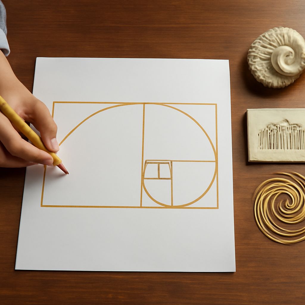
The golden ratio is a proportion of approximately 1.618 to 1. If a line or rectangle is divided so that the whole relates to the larger section in the same way the larger section relates to the smaller, the resulting relationship is called golden.
In composition, an artist can use this proportion to place a subject, divide a picture plane, or organize nested shapes. A golden rectangle can be extended into a spiral-like guide, directing the eye through successive areas of the image. The guide may help position a face near a focal area while leaving supporting space around it.
This proportion is not a requirement for beauty, balance, or artistic quality. Many claims that famous artworks strictly follow the golden ratio are interpretations rather than established facts. It is most useful as an optional planning or analysis tool, not a rule that every artwork must obey.
How Line, Value, and Proportion Work Together
These concepts can cooperate without becoming the same thing. An artist might use diagonal lines to lead toward a figure, a strong light-dark contrast to make that figure dominant, and a proportional division to place the figure slightly off-center. Line controls direction, value controls visual weight and depth, and proportion controls relationships across the whole format.
Leonardo’s Mona Lisa demonstrates how soft value transitions can model the face while surrounding contours and landscape paths guide attention. Hokusai’s The Great Wave uses sweeping curves, sharp contour lines, and strong dark-light separation to create motion and emphasis. Neither example needs to be labeled a strict golden-ratio composition to show how spatial organization can support line and value.
For analysis, first trace the dominant lines, then reduce the work to a few value groups, and finally inspect how the major shapes divide the frame. This sequence separates the artist’s visible choices from any proportional guide that may have informed them.