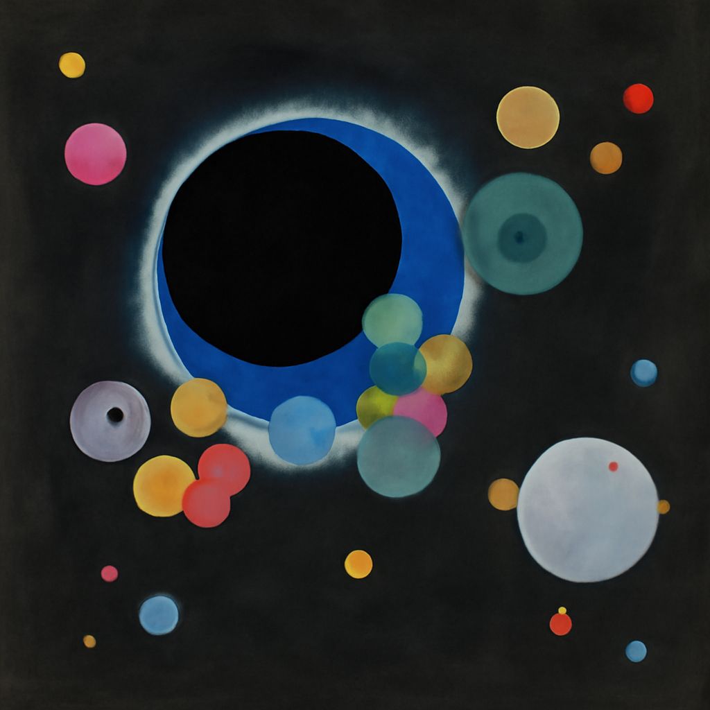
Symmetrical photography uses balanced relationships to create order, while unity connects an artwork’s parts into a coherent whole and variety introduces purposeful difference. These principles support one another: symmetry can establish stability, unity can hold contrasting elements together, and variety can prevent repetition from becoming dull.
The strongest compositions are rarely perfectly uniform. They repeat selected features—such as alignment, color, or shape—then alter scale, texture, spacing, or emphasis to keep the viewer engaged.
How Symmetrical Photography Works: Exact and Approximate Symmetry
Exact symmetry divides an image into matching halves or sections. A centered photograph of a classical facade, for example, may place an entrance on the central axis, with identical columns, windows, and decorative details on either side. A reflection in still water can create a similarly precise top-to-bottom balance.
Exact symmetry works best when the camera is carefully aligned with the subject. Small shifts in viewpoint can make one side larger, tilt horizontal lines, or move the central axis away from the frame’s midpoint. The result may still feel balanced, but it becomes approximate rather than exact.
Approximate symmetry preserves a recognizable relationship without requiring identical parts. A row of columns might repeat across a building while one doorway remains open, or a portrait subject might be centered against a background whose two sides differ slightly in light and texture. These deviations add natural detail without destroying the underlying structure.
Use exact symmetry when stillness, formality, or architectural precision is the priority. Choose approximate symmetry when the image needs more movement, atmosphere, or human irregularity.
Examples of Unity in Art: Repetition, Alignment, and Color
The clearest unity in art examples show how separate elements can feel related without becoming identical. Unity comes from repeated visual relationships, including:
- Repetition: recurring circles, arches, brushstrokes, figures, or photographic subjects establish a visual rhythm.
- Alignment: shared edges, baselines, axes, or directional lines make different elements appear intentionally connected.
- Color relationships: a limited palette, repeated accent color, or consistent warm-cool balance links areas across the composition.
- Surface and scale: related textures or a controlled range of sizes can make varied objects belong to the same visual system.
For example, an artwork might combine several geometric shapes in different sizes but align them to a common grid and repeat two colors throughout. The shapes vary, yet the grid and palette create unity. In a photograph of a market, different stalls and people can cohere through repeated vertical lines, similar lighting, and a shared color atmosphere.
The Definition of Variety in Art: Difference With Purpose
A useful variety in art definition is difference introduced to create interest, emphasis, or visual movement. Variety may appear through changes in shape, direction, size, contrast, material, spacing, or viewpoint. It is not random difference; each change should contribute to what the composition communicates.
Imagine a symmetrical photograph of repeated windows. If every window is identical in tone and detail, the image may feel static. One darker opening, a curtain in a single window, or a person crossing the central axis creates a focal point. The repeated windows preserve unity, while the interruption supplies variety.
Variety preserves unity when it modifies a shared system rather than abandoning it. A changing subject can remain connected through the same palette, repeated geometry, consistent lighting, or common scale.
Combining Order and Difference
Build a balanced composition by establishing order first, then adding controlled variation:
- Choose an organizing structure. Use a central axis, grid, repeated forms, or a dominant color relationship.
- Set the visual rhythm. Decide which elements will repeat and how closely they should align or space apart.
- Introduce a deliberate difference. Change one or two variables—such as scale, texture, direction, or tone—rather than altering everything at once.
- Check the connection. The variation should attract attention while still relating to the composition’s main axis, palette, pattern, or subject.
A symmetrical facade with one open window, a tiled pattern with a single contrasting tile, or a series of portraits using different expressions can all balance order and difference. The repeated framework gives the viewer stability; the variation provides a reason to keep looking.