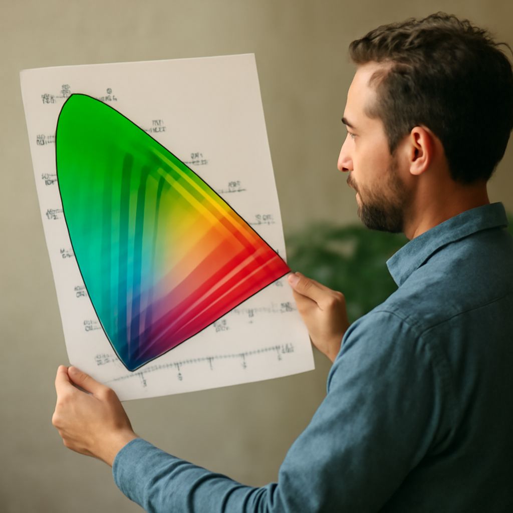
A brilliant red flower can look restrained on one screen and almost luminous on another. Choosing between DCI-P3 and sRGB involves more than selecting the setting with the larger range of colors: the file, editing software, display, and destination all affect what the viewer sees. For most general web delivery, sRGB is the dependable starting choice; a managed Display P3 workflow can preserve more saturated colors where the destination supports it.
What a Wider Gamut Changes
A color space defines how numerical color values correspond to colors. Its gamut is the range of colors it can represent. The DCI-P3 vs sRGB comparison starts with that range: P3 primaries allow a wider gamut than sRGB, particularly in some saturated reds and greens. A vivid red petal that falls outside sRGB can be represented in a P3-based space, while a conversion to sRGB must bring that color into the smaller gamut.
Most photographs contain many colors that fit within both spaces. In a comparison of DCI-P3 with sRGB, a wider gamut therefore does not automatically make every image look richer. The change is most noticeable when the original image contains colors beyond the smaller space and the entire viewing chain can reproduce them. Screen brightness and contrast also affect the impression of an image, so a more vivid display is not proof of more faithful color.
DCI-P3 and Display P3 Are Related, Not Identical
DCI-P3 was developed for digital cinema. Display P3 uses the same color primaries but a D65 white point, a definition of white suited to common display workflows, and the sRGB transfer function, which describes how signal values encode tonal brightness. Cinema DCI-P3 uses a different white point and transfer characteristics. Apple’s documentation describes the Display P3 definition.
When a monitor advertises P3 coverage, that specification describes a range it can reproduce; it does not mean a photograph should automatically be exported as cinema DCI-P3. For photographs destined for supported screens, look for the actual Display P3 export profile and the requirements of the destination. The distinction matters when comparing sRGB with cinema P3 because the two P3 labels imply different encodings.
Make Color Management Work
An embedded ICC profile tells compatible software how to interpret the numbers in an image. A color-managed application uses the image profile and the display profile to translate colors for the screen. Without that interpretation, the same RGB numbers can appear different across devices. Calibrating and profiling a monitor with a measurement device gives the system a more reliable description of its behavior; the International Color Consortium explains this process.
For a practical sRGB and P3 comparison, view the original in a color-managed editor on a profiled display, then preview or convert a copy to sRGB. Inspect saturated flowers, fabrics, or lights for visible changes. Conversion adjusts the numerical values to preserve the appearance as closely as the destination allows; simply assigning a different profile changes their interpretation and can shift the image unexpectedly.
Choose an Export for the Destination
The DCI-P3 vs sRGB decision becomes easier when the audience and platform are known. For a website, client delivery, or service with uncertain color support, export a copy in sRGB and embed its profile. Keep the higher-quality master so another version can be made later.
For a controlled display or a platform that explicitly supports Display P3, export a tagged Display P3 copy and check it in the intended application. Comparing a P3 export with an sRGB version on a compatible screen reveals whether the extra gamut matters for that particular photograph. Choose the version the destination can interpret consistently and the image actually benefits from.