JadeEllis
-
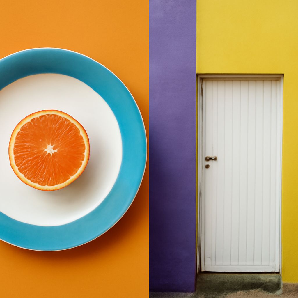
Balance in Art: Using Blue and Yellow Complementary Colors
Learn how balance in art works with blue-orange and yellow-violet palettes. Use value, saturation, area,… Read More
-
Difference Between Shape and Form in Painting
Learn the difference between shape and form, define line as an element of art, and… Read More
-
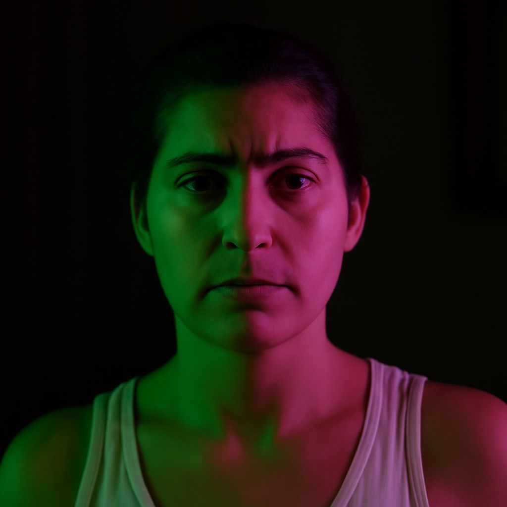
Complementary Colors for Pink and Blue in Photo Composition
Learn how complementary colors for pink and blue shift with hue, then use warm and… Read More
-
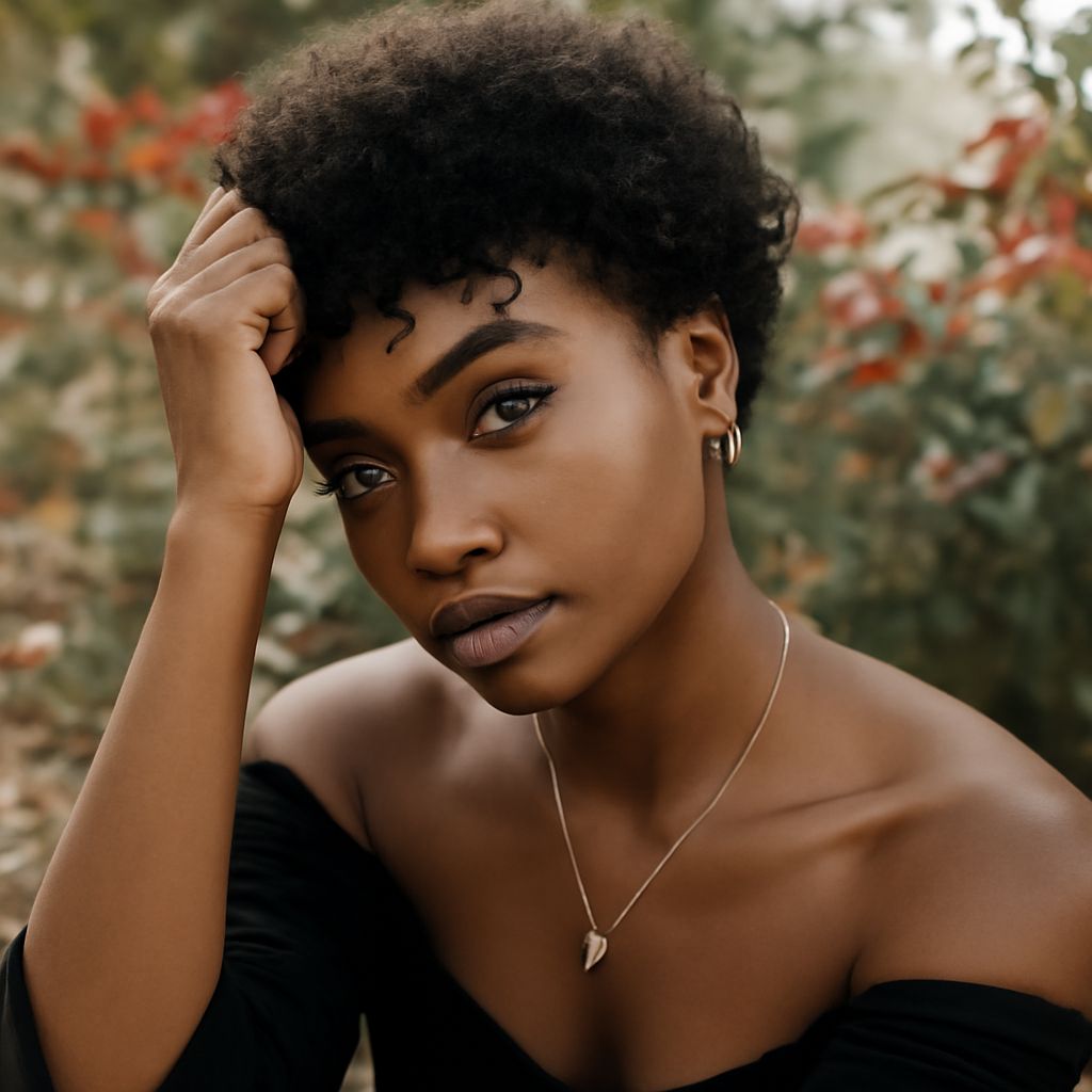
Lighting for Portraits: A Practical Guide to Posing
Learn how lighting for portraits shapes a flattering pose: set key-light height, direction, softness, and… Read More
-
Artistic Composition With Blue: Build Balanced Color Contrast
Artistic composition uses blue, orange, and controlled value, saturation, and proportion. Compare blue complementary colors.… Read More
-
Visual Texture in Art: How Proportion Shapes Composition
Learn how visual texture in art uses marks to suggest surfaces and guide attention. This… Read More
-
Form as an Element of Art: Using Line in Photography Composition
Learn the form as an element of art, how light and perspective create depth, and… Read More
-
Picture Composition With Shape, Form, and the Golden Ratio
Learn how picture composition organizes an image through shape, perceived form, overlap, light, perspective, and… Read More
-
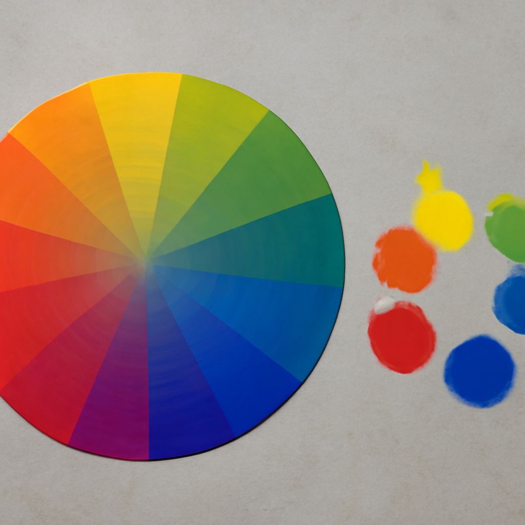
Types of Composition in Art: Balance and Color Theory
Learn the main types of composition in art, from symmetrical and radial to diagonal and… Read More
-
Emphasis in Design: Building Focal Points With Pattern
Emphasis in design gives the viewer a clear focal point; pattern builds rhythm through repetition,… Read More