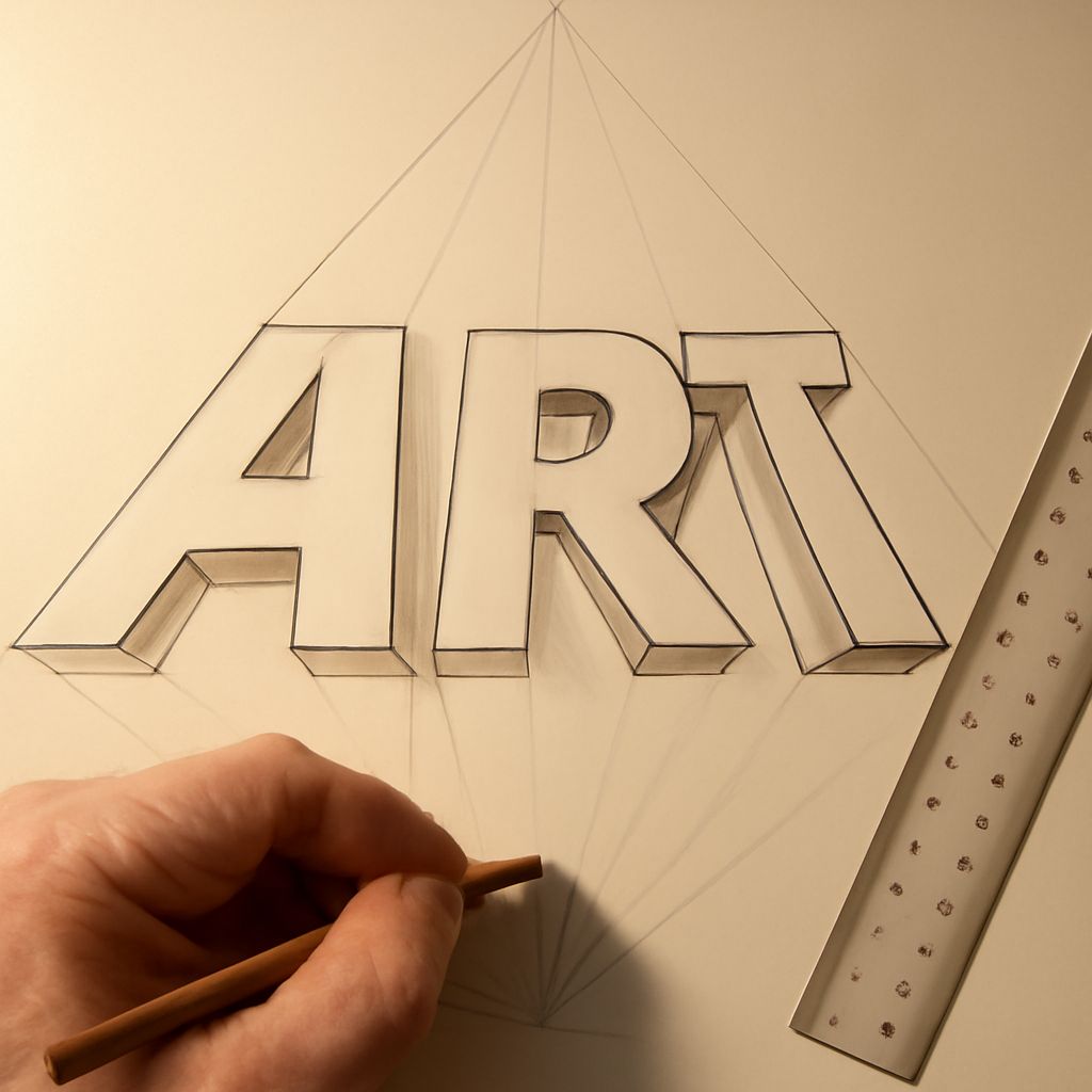
Learning how to draw fancy letters transforms ordinary writing into eye-catching art. Whether you’re crafting posters, personalizing journals, or designing social media graphics, mastering fancy lettering lets you create memorable, expressive visuals. This guide covers the entire process—from selecting materials to drawing stylized letters and adding dramatic 2 point perspective letters—providing practical steps and pro-level advice for all skill levels.
Getting Started with Fancy Lettering
Before moving your pencil, it’s essential to approach fancy lettering with the right mindset and foundational skills. Start by identifying the style you want to learn or develop. Do you admire ornate calligraphy, bold block letters, or whimsical scripts? Observe examples online, in books, or on signage to find inspiration and set a direction for your practice.
Understanding basic letterforms is crucial. Practice standard uppercase and lowercase letters so you recognize their proportions and spacing. Many artists sketch letters in pencil first, lightly marking guidelines to keep text even and consistent. Establishing a baseline, x-height, and cap height ensures every letter aligns correctly, even when you add flourishes or effects later.
Once you’re comfortable with the shapes, explore how spacing, slant, and embellishments change the feel of your letters. Don’t hesitate to create simple warm-up drills—tracing curves, practicing straight lines, or repeating single letters—to build muscle memory before tackling full words or phrases.
Essential Tools and Materials for Drawing Fancy Letters
The right tools make a significant difference in your lettering quality and enjoyment. While you can start with simple supplies, using materials suited to your chosen style helps you advance faster. Here’s what most lettering artists recommend for drawing fancy letters:
- Pencils (HB or 2B): Ideal for sketching guidelines and rough drafts. Softer leads create darker, smoother lines, while harder leads are less likely to smudge.
- Fine liners or Micron pens: For crisp, permanent outlines and detailed embellishments. Choose different nib sizes for varying line thickness.
- Brush pens or markers: These allow for expressive strokes, thick-to-thin transitions, and a calligraphic effect that’s difficult to achieve with standard pens.
- Eraser: A soft eraser helps you clean up pencil marks without damaging paper.
- Ruler and compass: A ruler keeps baselines straight and spacing even. Compasses work for creating accurate curves, circles, or arcs in decorative letters.
- Paper: Smooth, heavyweight paper prevents ink bleed and feathering. For advanced projects, consider mixed media or watercolor paper.
Some artists also use lightboxes to trace designs or grid paper for practice. As you progress, experiment with colored pencils, gel pens, or metallic markers to add visual interest and dimension.
Step-by-Step Instructions: How to Draw Fancy Letters
To master how to draw fancy letters, follow this structured approach:
- Sketch Guidelines: Lightly draw horizontal lines to mark the baseline, x-height, and cap height for your text. For script styles, add a slanted guideline at your preferred angle.
- Draw Basic Letter Shapes: Using pencil, sketch each letter within the guidelines. Focus on consistent proportions and spacing. This foundation prevents awkward letterforms once you add decorative elements.
- Embellish and Stylize: Add flourishes, serifs, curls, or swashes to elevate the letterforms. Thicken downstrokes for a calligraphic look, or extend curves for whimsical style. Keep flourishes balanced so the text remains legible.
- Outline in Ink: Trace your pencil lines with a fine liner or brush pen. Vary line width for visual interest, making some parts bold and others delicate. Let the ink dry before erasing pencil marks.
- Add Shading or Color: Use softer pencils, markers, or colored pens to add shadows, highlights, or patterns. Consider dotwork, crosshatching, or gradient fills for extra flair.
As you practice, try different alphabets, phrases, or quotes. Scan finished work for digital edits or print larger projects for display. Remember, steady improvement comes from repetition and exploration of new styles.
Adding Depth: Drawing 2 Point Perspective Letters
Creating 2 point perspective letters gives your text a dramatic, three-dimensional effect, perfect for posters or architectural lettering. Here’s how to draw letters with 2 point perspective:
- Mark Two Vanishing Points: On your paper, mark two points on the horizon line, far apart. These are your vanishing points—every angle of your letter’s sides will recede toward them.
- Draw the Letter’s Front Face: Sketch your chosen letter as if viewed straight on, keeping it between the vanishing points.
- Extend Guidelines: From each corner of the letter’s outline, draw light lines extending to both vanishing points. These lines will define how the sides of the letter recede in space.
- Define the Letter’s Depth: Decide how ‘deep’ you want the letter to appear. Draw parallel lines to the original front face, connecting the perspective guidelines and closing off the sides.
- Erase Unneeded Lines and Ink: Clean up the construction lines that fall behind the letter. Use a fine liner to ink the visible edges, then add shading or color to enhance the 3D effect.
This method works for block letters, numbers, and even entire words. Adjust letter depth and viewing angles for more dramatic or subtle perspective effects. Take your time with construction lines—they are the secret to realistic 2 point perspective letters that pop off the page.
Creative Tips for Personalizing Your Lettering Style
Developing a unique flair makes your fancy lettering memorable. Start by mixing influences: combine classic script with modern sans-serif, or merge gothic serifs with playful doodles. Test different embellishments on scrap paper before committing to a final piece.
Experiment with spacing, weight, and rhythm. Spacing letters closer or farther apart can convey tension or relaxation. Heavier downstrokes or unexpected swashes draw attention to key words. For extra dimension, layer colors, introduce shadow lines, or fill letters with patterns like stripes, dots, or florals.
Try unconventional tools: paintbrushes, chalk, or even digital tablets. Each medium yields distinct textures and moods. Practice with quotes, names, or lyrics you love to keep motivation high and develop consistent muscle memory.
Finally, seek feedback. Share your work on forums or with friends to get constructive critique. Save sketches and finished pieces to track your growth—a true lettering artist is always exploring new ways to make each letter their own.