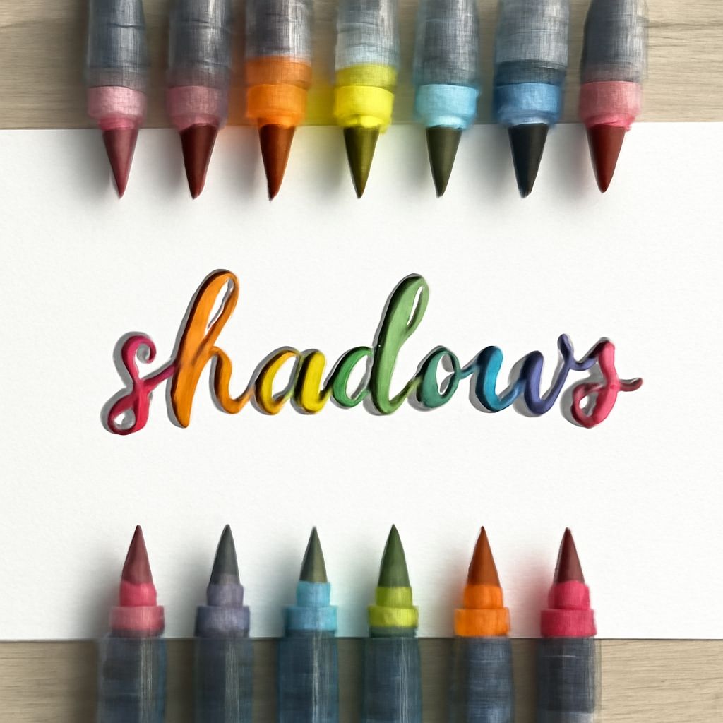
Shadow lettering is a captivating art form that adds depth and dimension to any typography design. Whether you are a novice or an experienced lettering artist, mastering how to shadow letters can elevate your work to a professional level. This guide will walk you through the essential steps and techniques for creating stunning shadow lettering.
Understanding Shadow Lettering Basics
Shadow lettering involves adding a shadow effect to your letters to create an illusion of depth. This technique can make your letters appear as if they are floating or popping out from the page. The key to successful shadow lettering is understanding the light source and consistently applying shadows in relation to it. Shadows should fall in the same direction and have a uniform length to achieve a realistic effect.
Materials Needed for Shadow Lettering
Before you begin, gather the necessary materials:
- Pencils: A range of pencils from HB to 6B will help you create different shades.
- Markers: Fine and chisel-tipped markers are useful for outlining and filling shadows.
- Eraser: A kneaded eraser is ideal for clean corrections.
- Ruler: A simple ruler helps maintain straight lines and uniform shadow lengths.
- Paper: Use smooth, high-quality paper that can withstand multiple layers of ink and pencil.
Step-by-Step Guide to Shading Letters
Follow these steps to create effective shadow lettering:
- Sketch Your Letters: Begin by lightly sketching your letters in pencil. Ensure your lines are clean and precise for easy outlining later.
- Determine the Light Source: Decide where your light source will be. This will dictate the direction of your shadows. A common choice is the top left corner.
- Add Outlines: Use a fine-tipped marker to outline your letters. This provides a clear boundary for your shadow work.
- Create the Shadows: Depending on the chosen light source, draw shadows extending from the opposite sides of each letter. Use your ruler to maintain consistent angles and lengths.
- Shade the Shadows: Fill in the shadow areas using markers or pencils. Start with a lighter color or shade and gradually build up to darker tones for a gradient effect.
- Refine the Details: Erase any visible pencil lines and make final touches to ensure that all shadows are consistent and smooth.
Common Mistakes to Avoid
Even seasoned artists can make errors in shadow lettering. Here are a few common pitfalls and how to avoid them:
- Inconsistent Shadow Direction: Ensure all shadows align with the light source. Inconsistent shadows can disrupt the illusion of depth.
- Uneven Shadow Lengths: Use a ruler to keep shadow lengths uniform, maintaining realism.
- Overcomplicating the Design: Start simple. Complex shadows can overwhelm the design and obscure the legibility of your letters.
Enhancing Your Designs with Advanced Techniques
Once comfortable with basic shadow lettering, experiment with advanced techniques to enhance your designs:
- Gradient Shadows: Use colored pencils or multiple ink shades to create gradient effects within shadows, adding more depth.
- Layering Shadows: Experiment with layering multiple shadows in different directions for a dynamic effect.
- Incorporating Textures: Add texture to shadows by using cross-hatching or stippling techniques.
By mastering these techniques and understanding the nuances of shading letters, you can create visually stunning typography that captures attention and adds artistic flair to any project.