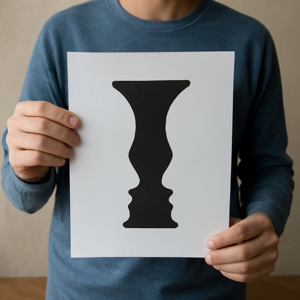
Value in art is the relative lightness or darkness of a color or tone. It is one of the fastest ways to guide the eye, because strong value contrast can make a subject stand out immediately, while similar values can let forms blend together. In practice, value is not just about realism; it is a visual tool for control, emphasis, and ambiguity.
The same tonal relationship also shapes Gestalt figure-ground, the perceptual process that helps viewers decide what is the figure and what is the background. In art, that decision is often driven by contrast, edge clarity, and the way shapes overlap or share boundaries.
Value as a Light-to-Dark Relationship
A useful value in art example is a white cup on a dark table. Even before you register the cup’s details, the bright form reads as separate because its value is much lighter than the surface behind it. If the cup were the same mid-gray as the table, it would lose much of its separation and become harder to isolate.
This is why value studies are so effective in drawing and painting. They reduce the image to light and dark masses, making it easier to see whether a subject is readable. A face lit from one side, for example, becomes more dimensional when the shadow side is darker than the background. When the values are too close, the plane shifts are harder to see and the form can flatten.
What Gestalt Figure-Ground Means
The figure-ground Gestalt principle describes how the eye organizes a visual field into a focal shape and its surrounding field. The figure is what seems to come forward; the ground is what recedes or supports it. These are perceptual roles, not fixed labels. A dark shape can become figure against a light field, but in another composition the light area may take that role instead.
This matters because Gestalt figure-ground is not based only on outline. Value contrast, edge sharpness, and shape dominance all affect which area appears primary. Strong contrast usually stabilizes the reading. Low contrast or shared edges can make the visual relationship less certain.
Examples of Stable and Reversible Figure-Ground
A stable figure-ground image might show a black silhouette of a tree against a pale sky. The tree is easy to identify as the figure because its value is clearly darker, its edges are distinct, and its shape is memorable. The sky remains the ground because it provides a continuous field around the tree.
An ambiguous or reversible example is the classic black-and-white vase/faces image. At one moment, the white center reads as a vase, and the black side shapes recede. Then the black areas become two face profiles, and the white center shifts into the ground between them. The tonal balance does not change, but perception does. That reversal shows how figure and ground are assigned by the viewer’s attention, not permanently fixed by the artwork.
Low-contrast images can create a softer version of this effect. In a gray-on-gray painting, a person may seem to emerge slowly from the background rather than snap into focus. This is useful when an artist wants atmosphere, subtlety, or tension instead of instant recognition.
Using Value to Clarify or Complicate the Subject
Artists use value to control how easily a subject is read. High contrast between figure and ground clarifies the silhouette and strengthens emphasis. It is ideal when the subject must be found quickly, such as in poster design, portrait lighting, or a dramatic focal point in a painting.
Lower contrast does the opposite: it complicates separation and can make the subject feel embedded in the environment. This approach is effective when the goal is mood, visual unity, or a deliberate search for the subject. A figure painted in nearly the same value as the ground may seem to drift in and out of visibility, which can create quiet tension.
For artists, the practical question is not whether the ground matters, but how value organizes the whole image. Strong tonal contrast creates clear structure. Shared or close values create ambiguity. Both are useful, depending on whether the composition needs certainty, reversal, or a more atmospheric reading.