In the vibrant world of color, secondary colors hold a special place for artists, designers, and photographers alike. Understanding what secondary colors are and how they are formed can significantly enhance your creative projects. Let’s delve into the essence of secondary colors and their impactful role in photography.
Understanding Secondary Colors
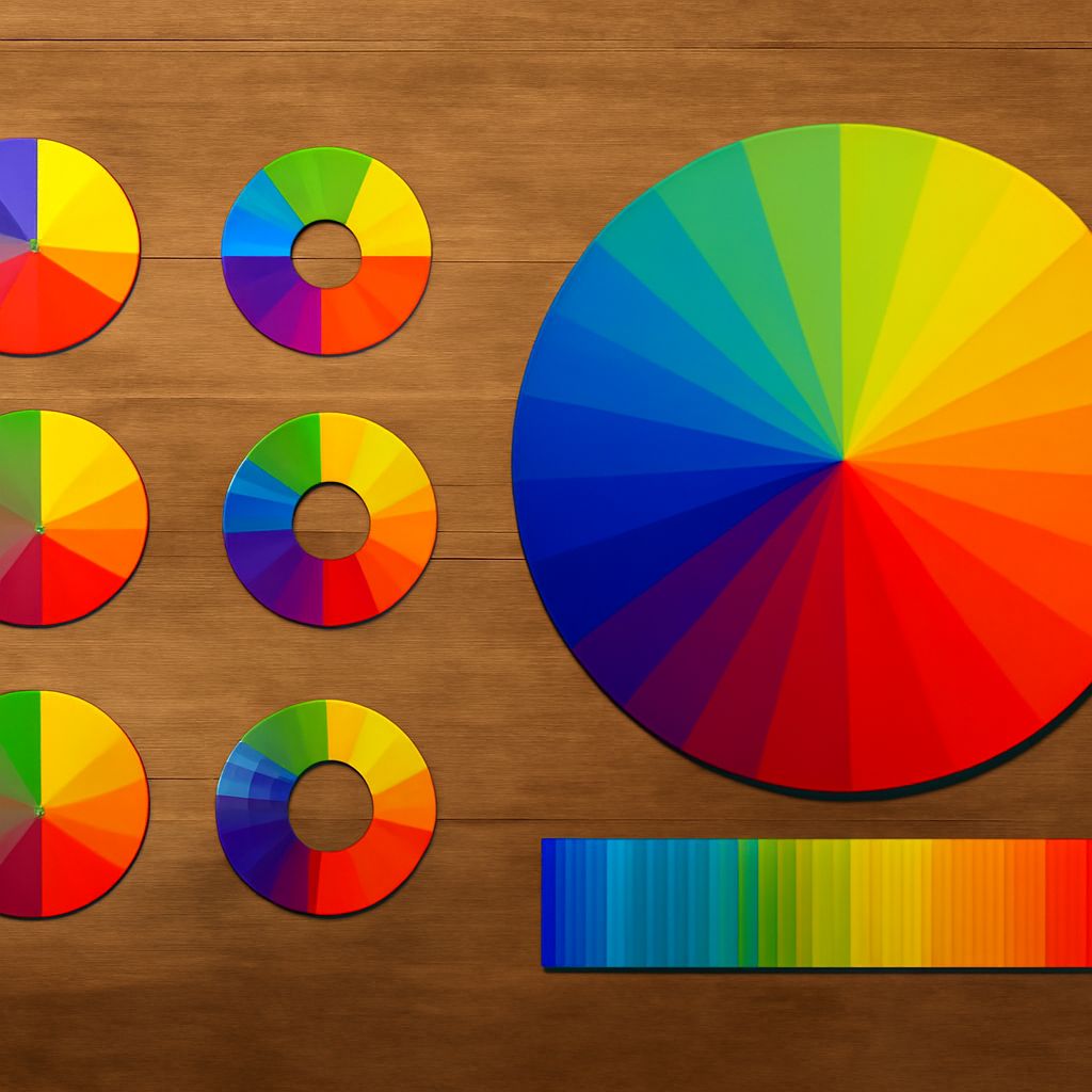
Secondary colors are hues created by mixing two primary colors. In the traditional color wheel, the primary colors are red, blue, and yellow. When combined, they form the secondary colors: green, orange, and purple. This blend offers a broader spectrum of tones to work with, enriching visual compositions and enhancing the depth of images.
How Secondary Colors Are Formed
To create secondary colors, you mix equal parts of primary colors. Here’s how each secondary color is formed:
- Green: Created by mixing blue and yellow.
- Orange: Formed by combining red and yellow.
- Purple: The result of mixing red and blue.
These combinations can be adjusted by varying the proportions to create different shades and tones, allowing for a custom color palette tailored to your creative needs.
The Role of Secondary Colors in Photography
In photography, secondary colors play a crucial role in creating balanced and engaging compositions. They can be used to evoke emotions, create contrast, and draw the viewer’s eye to specific elements within a frame. By understanding the relationship between colors, photographers can enhance the storytelling aspect of their images.
For instance, using green in nature photography can create a sense of tranquility, while orange tones might add warmth to a sunset shot. Purple can introduce a sense of mystery or elegance. By strategically using secondary colors, photographers can guide the viewer’s emotional response and interaction with the image.
Practical Tips for Using Secondary Colors
Here are some practical tips for effectively using secondary colors in your photographic work:
- Contrast and Complement: Use secondary colors to create contrast against primary colors. This can make your subject stand out and add depth to the image.
- Emotional Tone: Consider the emotional impact of secondary colors. Green can be calming, orange energetic, and purple regal or mysterious. Align the color choice with the mood you wish to convey.
- Color Harmony: Incorporate secondary colors to achieve harmony within the photograph. Balance them with both warm and cool tones to maintain an aesthetically pleasing image.
- Experiment: Don’t hesitate to experiment with different combinations and shades of secondary colors. This can lead to unique and striking results that stand out.
By mastering the use of secondary colors, photographers can significantly enhance their visual storytelling capabilities. Understanding and applying these colors effectively can transform ordinary photographs into compelling works of art.