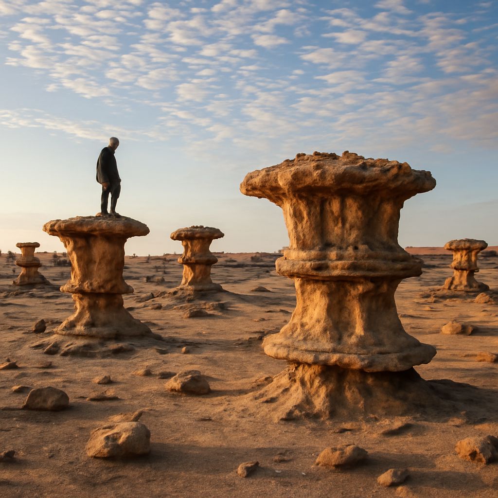
Visual texture in art is the illusion of a surface created through marks, patterns, contrast, and edges. Short, irregular strokes can suggest rough bark; parallel lines can imply brushed metal; soft blended transitions can make skin or stone appear smooth. These cues help viewers judge material, depth, and emphasis without the artist physically changing the surface.
Actual texture is physically present, while visual texture is perceived. In a successful art composition, artists often combine both: a raised, gritty layer of paint may catch real light, while painted cracks or repeated dots create texture only through sight. Proportion determines how these textures relate to one another, controlling hierarchy, realism, rhythm, and cohesion.
Visual Texture in Art: Actual Texture Versus Implied Surface
Actual texture, also called tactile texture, can be touched. Thick impasto, scraped pigment, collage, sand, fabric, and carved wood all alter the artwork’s physical surface. Their shadows and highlights change as the viewer moves, so the texture operates through both touch and changing light.
Visual texture is an illusion on a flat or relatively even surface. Artists build it with specific mark-making choices:
- Dense, broken strokes can suggest the tangled surface of grass or fur.
- Long, parallel marks can indicate wood grain, brushed steel, or flowing hair.
- Fine crosshatching can model cloth, shadow, or rough stone.
- Sharp dots and flecks can evoke sand, splattered paint, or a porous wall.
- Gradual tonal transitions can make glass, polished skin, or wet ceramic appear smooth.
The key distinction is not realism versus abstraction. A simplified painting may use highly convincing texture, while a realistic image may deliberately flatten a surface. Visual texture depends on consistent signals: mark direction, spacing, edge quality, contrast, and the way marks follow the form they describe.
What Proportion in Art Means: Relative Scale, Not Absolute Size
Proportion in art describes the relationship between parts of an image, rather than the absolute size of any single object. A figure can be large on a small canvas yet remain proportionate if its head, torso, limbs, and surrounding space relate plausibly. Likewise, a tiny tree may be correctly proportioned to a distant building within a landscape.
Artists use proportion at several levels. Internal proportion compares parts within an object, such as a vase’s opening to its height. Comparative proportion relates separate objects, such as a chair to a person. Spatial proportion considers an object’s size against the frame or the surrounding areas.
Changing these relationships changes meaning. An oversized hand can make a figure feel powerful or expressive; a minute doorway can make architecture feel monumental. Proportion also affects texture: a close foreground surface can support broad, legible marks, while a distant surface needs smaller, quieter signals to remain convincing.
Art Composition: Texture Density and Proportional Scale
Texture carries visual weight. A patch filled with dark, high-contrast marks attracts attention more quickly than an open, lightly textured area. Texture density means the amount and concentration of surface information in a given space. Increasing density can create emphasis, activity, roughness, or closeness. Reducing it can create calm, distance, or visual breathing room.
Proportional scale modifies that effect. Large marks on a small object can make its surface feel coarse and dominant. The same marks spread across a large background may read as distant rocks or broad foliage. Fine marks compressed into a small area can suggest intricate detail, but too much uniform detail may flatten the hierarchy by making every region equally demanding.
Use contrast strategically. Place the densest texture near the focal point when attention should collect there, then simplify surrounding surfaces. To push an object back, reduce mark contrast, scale down the texture pattern, soften edges, and allow neighboring forms to overlap it. Repeating related marks at different scales creates rhythm, while leaving intervals of quieter surface prevents visual fatigue.
Analyzing Texture and Proportion in Finished Compositions
Start by identifying the focal area and asking which surface information supports it. In a portrait, tightly observed pores, hair strands, or fabric folds around the face can reinforce attention. If every garment and background shape receives equal density, the face loses priority. A controlled shift from detailed texture to broad, quiet passages restores hierarchy.
In a landscape, compare the proportional scale of marks across depth. Foreground grass may use large, directional strokes with strong value changes. Middle-ground foliage can use grouped shapes and fewer accents. Distant trees may become compact color masses with minimal texture. This progression makes space believable because texture scale responds to distance rather than remaining mechanically consistent.
For a still life, compare the surface character and size relationships of each object. A small, rough lemon beside a broad, smooth ceramic bowl can become the focal contrast if its textured skin receives sharper marks or stronger color variation. Keep some proportional balance by repeating a related yellow accent elsewhere, or by echoing the bowl’s curve in nearby mark directions.
A practical analysis follows three checks: where is texture most concentrated, which objects occupy the greatest relative area, and do mark sizes agree with the implied distance? Adjusting any one of these can redirect attention without changing the subject itself.