
Breaking News


Editor’s Choice

Relative News
Hot Topics
Popular Blog
-
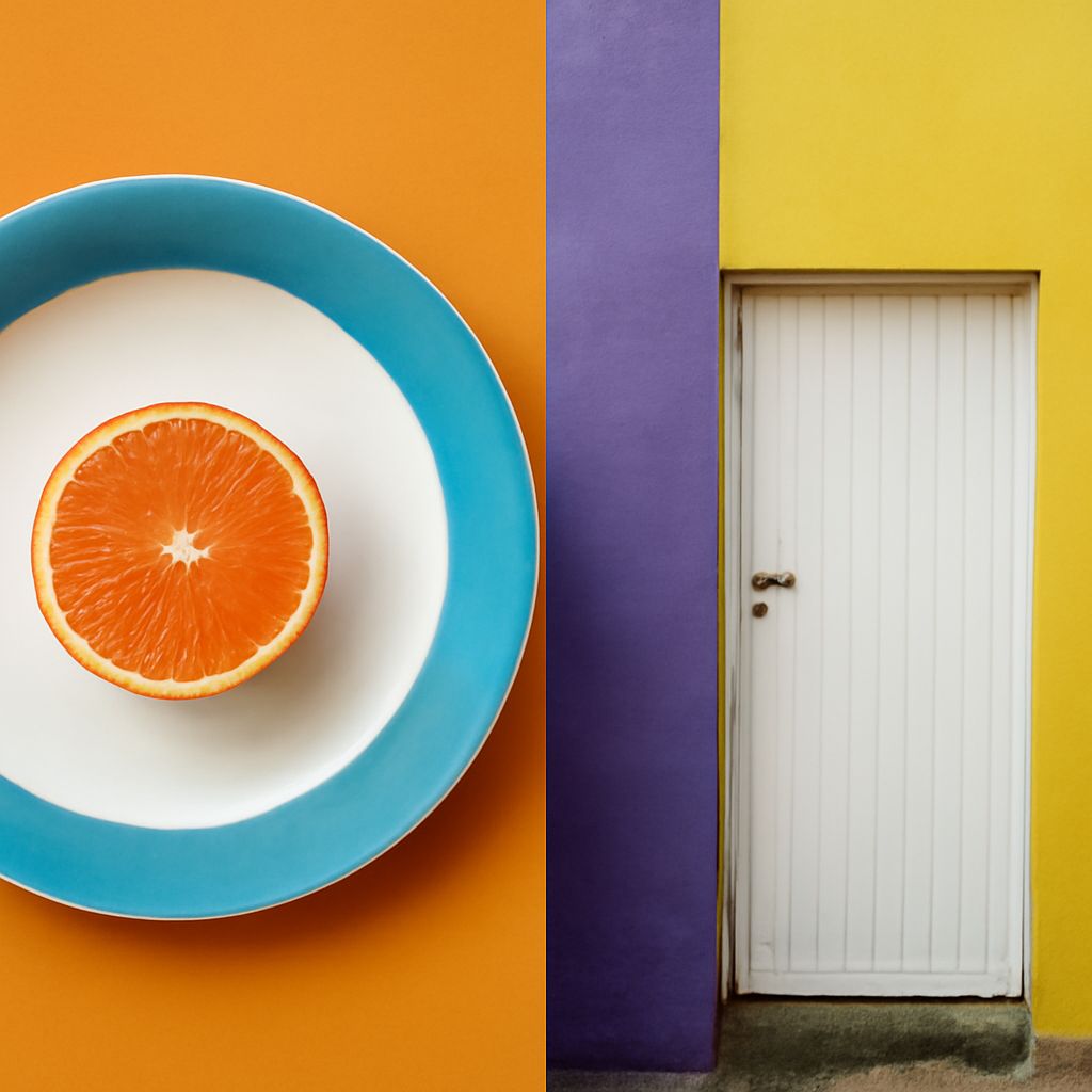
Balance in Art: Using Blue and Yellow Complementary Colors
Read More: Balance in Art: Using Blue and Yellow Complementary ColorsLearn how balance in art works with blue-orange and yellow-violet palettes. Use value, saturation, area, and placement so a small, intense accent can balance a…
-

Difference Between Shape and Form in Painting
Read More: Difference Between Shape and Form in PaintingLearn the difference between shape and form, define line as an element of art, and use the golden ratio in painting to guide placement, balance,…
-
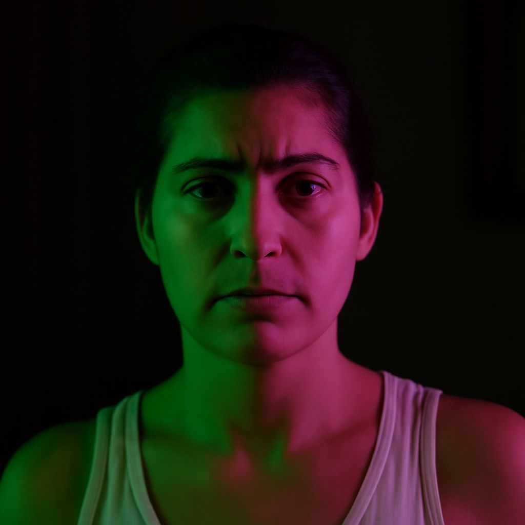
Complementary Colors for Pink and Blue in Photo Composition
Read More: Complementary Colors for Pink and Blue in Photo CompositionLearn how complementary colors for pink and blue shift with hue, then use warm and cool contrasts, value, saturation, and placement to build clear photo…
-
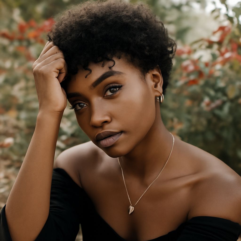
Lighting for Portraits: A Practical Guide to Posing
Read More: Lighting for Portraits: A Practical Guide to PosingLearn how lighting for portraits shapes a flattering pose: set key-light height, direction, softness, and distance, then refine posture, hands, face angle, catchlights, and expression.
-
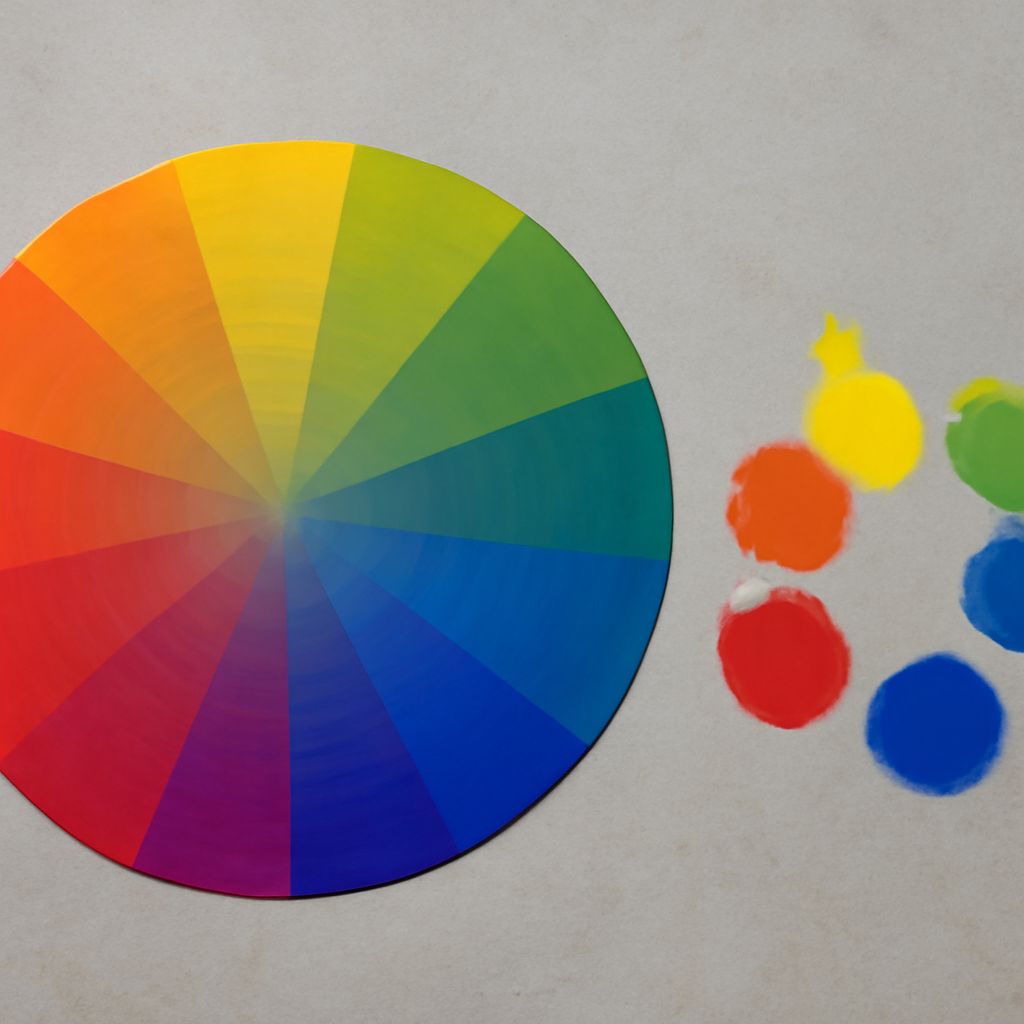
Artistic Composition With Blue: Build Balanced Color Contrast
Read More: Artistic Composition With Blue: Build Balanced Color ContrastArtistic composition uses blue, orange, and controlled value, saturation, and proportion. Compare blue complementary colors. Apply color theory in art for balanced or intense palettes.
-
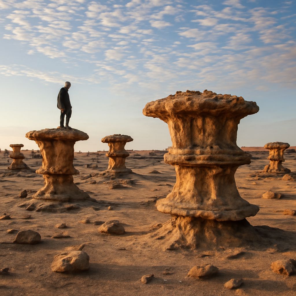
Visual Texture in Art: How Proportion Shapes Composition
Read More: Visual Texture in Art: How Proportion Shapes CompositionLearn how visual texture in art uses marks to suggest surfaces and guide attention. This practical guide shows how artists use scale to create depth,…
You May Have Missed